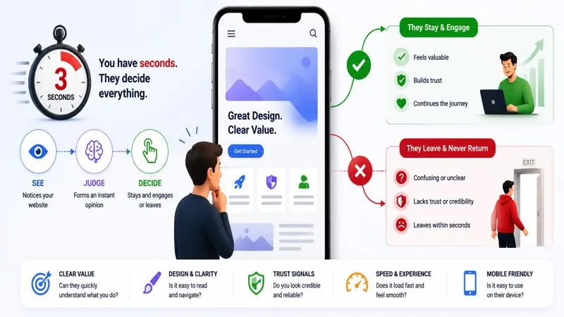
Modern websites look more polished than ever, yet many businesses still struggle to keep people engaged for even a few seconds. In many cases, website visitors leave quickly not because the design looks bad, but because the experience feels confusing, slow, overwhelming, or emotionally disconnected. Attention spans online are changing fast, and modern users now judge websites almost instantly before deciding whether to stay or leave.
Mobile users decide everything quickly
When mobile users search something on Google, they already expect the answer to appear fast.
For example, if someone searches:
“best earbuds under 2000”
they usually open 2–3 websites very quickly and instantly compare:
- which website looks cleaner
- which page loads faster
- which content feels easier to understand
- which website looks trustworthy first
Most mobile users don’t read everything carefully at the beginning.
They first look at:
- the top part of the page
- product images
- headings
- font readability
- clutter
- ads
- page speed
And within seconds, they mentally decide:
👉 “this website feels useful”
OR
👉 “this website feels annoying”
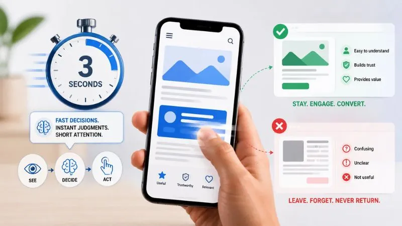
That first feeling matters a lot on mobile.
Because mobile users are usually:
- scrolling quickly
- comparing many tabs
- using one hand
- switching apps constantly
- looking for instant clarity
If the website creates even small frustration early:
- slow loading
- too many popups
- messy layout
- hard-to-read text
- overwhelming design
many users immediately go back to Google and open another result instead.
That’s why modern mobile visitors often judge websites emotionally before they fully understand the actual content.
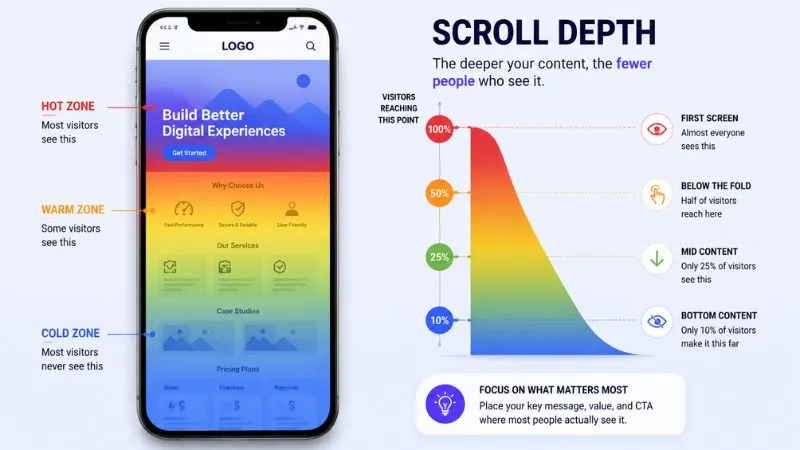
Most visitors never scroll deep enough
One important thing many website owners don’t realize is this:
Visitors usually decide whether a website feels useful long before reaching the middle or bottom of the page.
Most users are not opening a website with patience.
They are opening it with expectation.
The moment the page loads, their brain immediately starts scanning:
- “Does this look useful?”
- “Can I trust this?”
- “Will this waste my time?”
- “Am I finding what I searched for?”
That decision happens very fast.
If the top section feels:
- generic
- overloaded
- confusing
- visually tiring
- slow to explain the value
many users mentally disconnect before scrolling deeper.
Even if the best content exists lower on the page, visitors may never reach it because the website already failed the first impression test.
This is especially common now because modern internet behavior is built around:
- fast scrolling
- instant judgment
- short attention shifts
- constant comparison
People are no longer exploring websites slowly like older internet users.
They quickly scan the top area and subconsciously decide:
👉 “continue”
OR
👉 “go back”
That’s why many websites lose visitors before the actual valuable content even appears on screen.
The problem is often not the information itself —
it’s how quickly the website convinces users to keep scrolling.
Websites look better — but feel weaker
A few years ago, a simple website with clear information was often enough to keep people engaged.
Now many websites look visually stunning from the first second:
- glowing effects
- smooth scrolling
- modern UI
- cinematic banners
- fancy animations
But strangely, visitors still leave very fast.
Because modern users are no longer impressed by design alone.
Today, beautiful design has become common everywhere.
When almost every website starts looking polished, users begin paying attention to something else:
👉 how the website makes them feel while using it
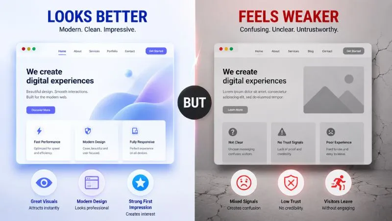
For example, imagine opening two websites.
The first website looks visually amazing, but:
- the message feels generic
- sections feel confusing
- content sounds artificial
- too many animations distract attention
The second website may look simpler, but:
- the message feels clear
- the content feels human
- visitors instantly understand the value
- navigation feels effortless
Most users quietly trust the second website more.
That’s because engagement is emotional before it becomes logical.
People stay longer when a website feels:
- clear
- natural
- trustworthy
- easy to follow
- genuinely useful
Not simply when it looks expensive.
This is becoming one of the biggest modern website problems:
👉 websites are improving visually faster than they are improving user connection
And visitors notice that difference very quickly now.
Many websites struggle with engagement for the same reason they struggle with traffic — visitors leave before the website creates enough trust or interest to continue exploring. If you want to understand the bigger connection between visibility, user behavior, and online growth, you can also read our article on Why My Website Is Not Getting Traffic
Visitors decide before engagement starts
Many people think website engagement starts when users begin reading content carefully.
But most engagement decisions actually happen much earlier — often before visitors even scroll properly.
The moment a website opens, users immediately start feeling the experience subconsciously.
Not analyzing.
Not reading deeply.
Just feeling.
For example, within seconds visitors silently judge things like:
- “This feels complicated.”
- “This looks trustworthy.”
- “This feels outdated.”
- “Too much is happening here.”
- “This is easy to understand.”
- “This already feels tiring.”
And those small emotional reactions quietly decide whether attention continues or disappears.
This is why engagement is not only controlled by:
- good design
- better colors
- animations
- modern layouts
Sometimes a visually simple website creates stronger engagement because users instantly feel mentally comfortable using it.
Think about modern internet behavior now.
People open websites while:
- scrolling fast
- multitasking
- switching apps
- checking notifications
- comparing many pages quickly
Their attention is already divided before the website even loads.
So if the first experience feels:
- mentally heavy
- visually noisy
- confusing
- slow to explain itself
users often disconnect emotionally before the actual content even gets a chance.
That’s why some websites lose engagement even when they contain valuable information.
The issue is not always:
❌ “bad content”
Sometimes the real problem is not the content —
visitors lose interest before the website makes them feel comfortable or useful.
Modern users now leave very quickly when a website feels confusing, overloaded, or difficult to follow.
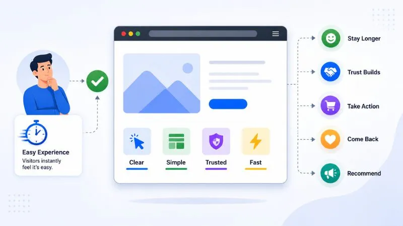
Visitors Stay When Websites Feel Easy
The biggest solution for low engagement is not making websites “more advanced.”
It’s making visitors feel comfortable immediately.
Most users open a website with one simple expectation:
👉 “Help me understand this quickly.”
If the website instantly creates clarity, people naturally continue exploring.
But if visitors feel even small confusion at the beginning, attention starts dropping very fast.
For example, many websites lose engagement because:
- the main message is unclear
- visitors don’t know where to look first
- important information appears too late
- the homepage feels visually busy
- everything competes for attention at the same time
Modern users don’t have patience to “figure out” websites anymore.
That’s why strong websites usually focus on:
- clear first impression
- simple structure
- readable content
- fast understanding
- fewer distractions
- easy mobile experience
The goal is no longer:
❌ “make the website look expensive”
The real goal now is:
✅ “make visitors feel comfortable staying”
Because engagement improves naturally when visitors stop feeling mentally overloaded.
At the end, most people don’t remember:
- animations
- effects
- fancy layouts
They remember:
👉 whether the website felt easy to trust
👉 easy to understand
👉 and worth continuing to explore
Website engagement also directly affects how websites make money online. Even visually beautiful websites may fail to generate leads, sales, or revenue if visitors don’t stay long enough to interact with the content or business properly. We explained this deeper in Why Some Websites Make Money… And Most Don’t
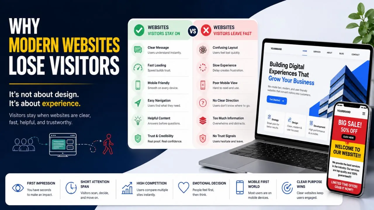
Visitors Stay vs Leave Fast
| Visitors Stay | Visitors Leave |
| Clear message | Confusing start |
| Easy reading | Messy layout |
| Fast loading | Slow feeling |
| Simple design | Too much clutter |
| Trust feeling | Feels suspicious |
| Smooth scrolling | Too many distractions |
| Useful quickly | Hard to understand |
| Human content | Generic content |
| Comfortable flow | Mentally tiring |
Google itself has repeatedly emphasized that page experience, usability, mobile friendliness, and website performance strongly affect how users interact with websites online. Their official documentation also explains why user experience matters more than ever for modern websites. Google Page Experience documentation
FAQ
Are people becoming less patient online now?
Yes. Mobile scrolling, short-form content, social media habits, and faster internet behavior have significantly reduced how long users stay focused on one website.
Can too much design actually hurt a website?
Yes. Excessive animations, popups, effects, and clutter can make websites feel stressful instead of engaging, especially for mobile users.
Is engagement more psychological now?
Very much. Modern users often decide emotionally first and logically later. If the website feels easy and comfortable instantly, engagement naturally improves.
Do visitors trust websites instantly now?
Very rarely. Modern users usually become suspicious very quickly online, especially when websites feel overly promotional, confusing, or generic.
Does website speed affect user trust?
Absolutely. Slow-loading websites often create frustration instantly, and many visitors leave before the page fully opens.
Can too many sections reduce engagement?
Yes. When websites keep adding unnecessary blocks, animations, or distractions, visitors may lose focus before reaching important content.
🤘 Modern websites no longer succeed only because they look beautiful. Visitors stay longer when websites feel clear, trustworthy, simple to understand, and comfortable to use from the very first few seconds.